
Industry
GovTech, Public Sector
Highlight
34-sec catalog lookup · 80+ libraries
VÖBB: Designing Faster Information Discovery

Impact
Making complex search and navigation in over 80 libraries feel simple and effortless by accelerating book search time to 34 Seconds.
Time
May 2025 - July 2025
Tool

Business Problem
Poor navigation and search on the Berlin Central Library Search Service Website, VÖBB (Association of Berlin Public Libraries) prevented users from finding books efficiently and further affects user adoption.
Solution
A book search workflow redesigned to reduce book-searching time for users accessing 80+ public libraries from the Berlin Central Library Search System Service.
My Role
UX/UI Designer
Performed UX Design audit including 8 usr testing interviews,comparative analysis
Designed high-fidelity prototypes of website and app to enhance interface accessibility and usability.
Conducted A/B testing to evaluate two design concepts and validate design hypothesis
UX Design Audit
Goal
To identify user pain points and user expectations for book search on the VÖBB website and discover design ideas to enhance user experience.
User Testing Feedback
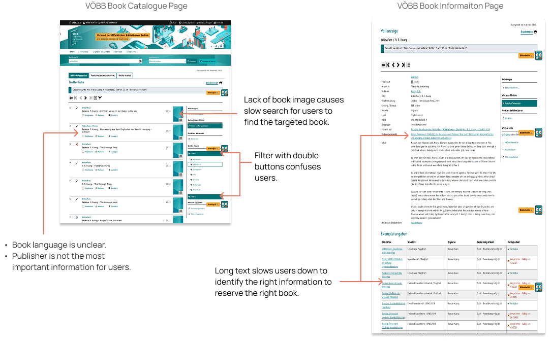
To begin with, I conducted 8 user testing interviews to collect user feedback on their experience with VÖBB website to search a book in which they are interested. The findings are valuable for discerning design issues and opportunities.

Comparative Analysis
Based on the user testing feedback, I found 4 websites that have comparatively clear book search catalog to compare their features with VÖBB book search catalog.

Design
Design Hypothesis
If we show essential information and options on the book catalogue page, users can spend shorter time reserving the book without visiting the book details page so that we can speed up their book reservation decisions by 25 % and achieve 90% positive user feedback on the redesigned website.
After conducting the UX design audit, I created design concept A and B for the book catalog page which is the key user flow to find the right book.
Design Concept A & B
Compared to design concept A which changes the whole UI design, concept B only has 5 mild changes on the original design to speed up user flow:
Original

Concept A

Header redesign
Simplified search category dropdown menu
Redesigned filters and sorting
Added book language text
New book card design
Different types of book formats tabs on the book card
Book available status label
Enlarged book cover image
Concept B

Removed the search bar dropdown menu
Added book language label
Clearly displayed book formats
Added book covers image
Separated filters from sorting
Reorganized book information hierarchy: Book image on the left, information text on the right
A/B Testing
To compare design concept A and design concept B in terms of completion time of finding the right book, I used maze to conduct unmoderated A/B testing with for design validation.
Testing
The goal is to evaluate whether Concept A or Concept B helps users find and reserve the right book more efficiently on the VÖBB book catalog. Success metrics includes task completion time faster than 1 minute, the completion time from the original website and task completion rate. The participants who use or have used library website were 17 in total.
Result
According to the testing result, 7 users spent around 1.2 times less time finding the right book and ordering it with design concept B compared to 10 users with design concept A. The misclick rate of concept A is simliar to that of concept B. The completion time for both concepts are faster than the original compeltion time. 73 % of testers found the task experience easy and very easy.
The follow up questions after completing the task include:
How was your experience with the task?
Feel free to share your feedback and questions on this overall testing experience.
Variant A: Design Concept A

Variant B: Design Concept B

Learning & Proposals
Users are not used to the considerable change of design on the book catalog page, which causes more time searching the right book and clicking the order button in concept A than concept B with gradual small design changes. Concept A and concept B both share over 80 % misclick rate which needs further exploration for design improvement.
My proposal for improvents is to choose concept B for the redesign prototype and add clearly visible book ordering information to lower misclick rate.
Lessons Learned
Working on this first personal UX/UI Design project taught me how to perform the UX Design audit and create high-fidelity website and app prototypes with the consistent visual design and design system for a complex information system platform indepedantly. Furthermore, conducting A/B testing is the key to understanding user behavior, developing my competence in design process and decision-making skill as a UX designer. With the mentor's support and my previous change management experience, I learned to own end-to-end product design development and apply feedback to my design iterations with strategic thinking to simplify the complex workflow.
Footnotes
High-fidelity Prototype: Concept A
Desktop

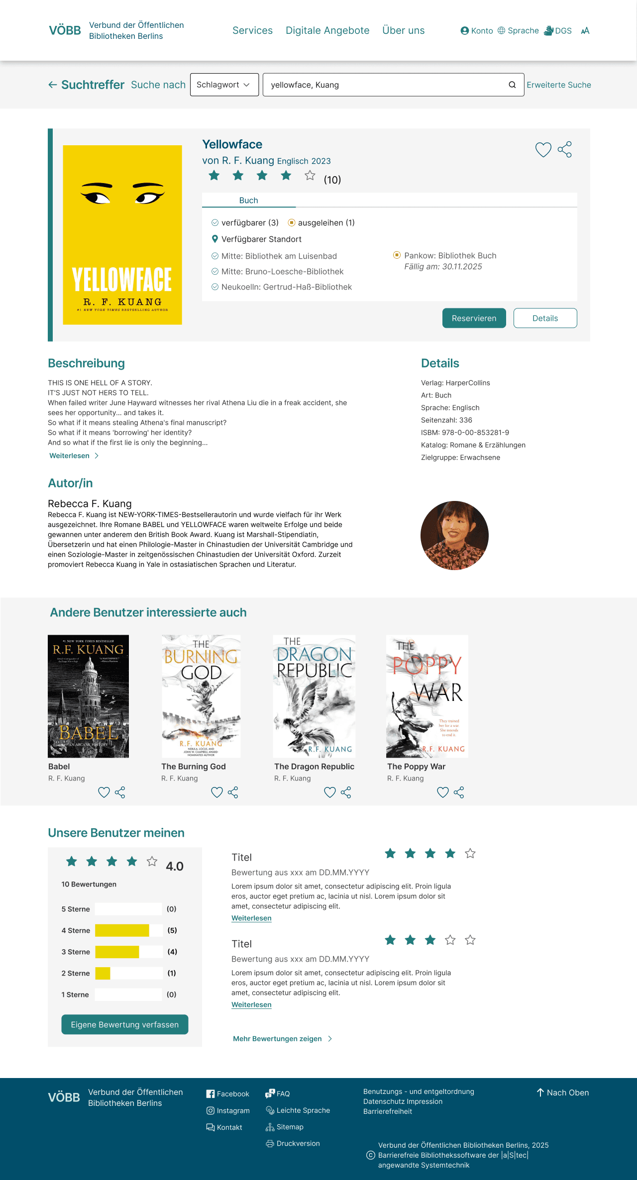
Desktop edge case


Mobile

Simplified Information Architecture
Before

After

Streamedlined User Flow
The simplified user flow demonstrates the primary user flow of using search bar to find a book. The streamlined primary user flow with the redesigned VÖBB website and app is presented by click dummy.

Primary User Flow Click Dummy: Website & App
Design System & Reusable Components
To keep visual design and brand consistent and iteration efficient, I created a design system and reusable components that enhance accessibility and usability of user interaction with website and app interface.
